Overview
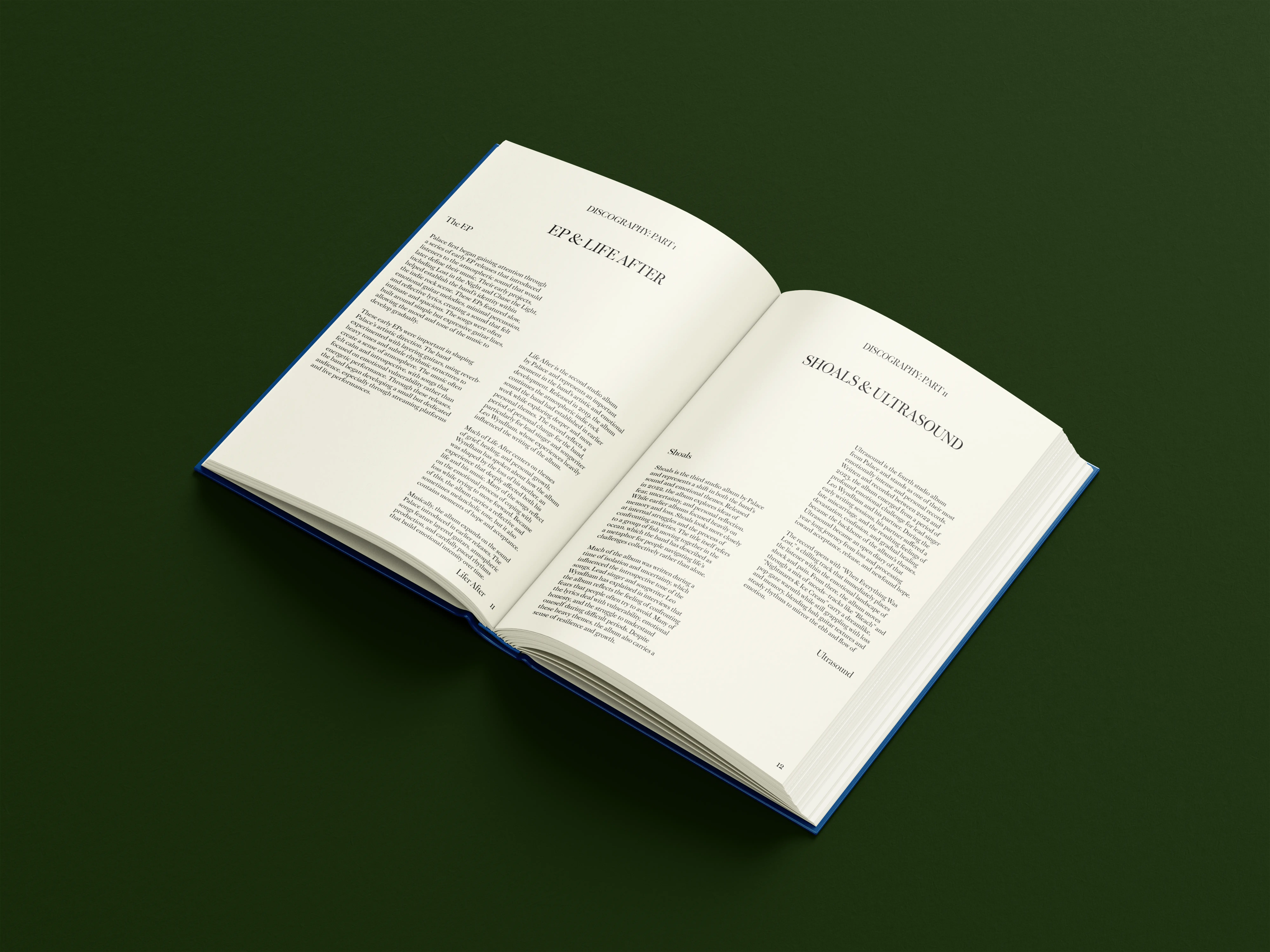
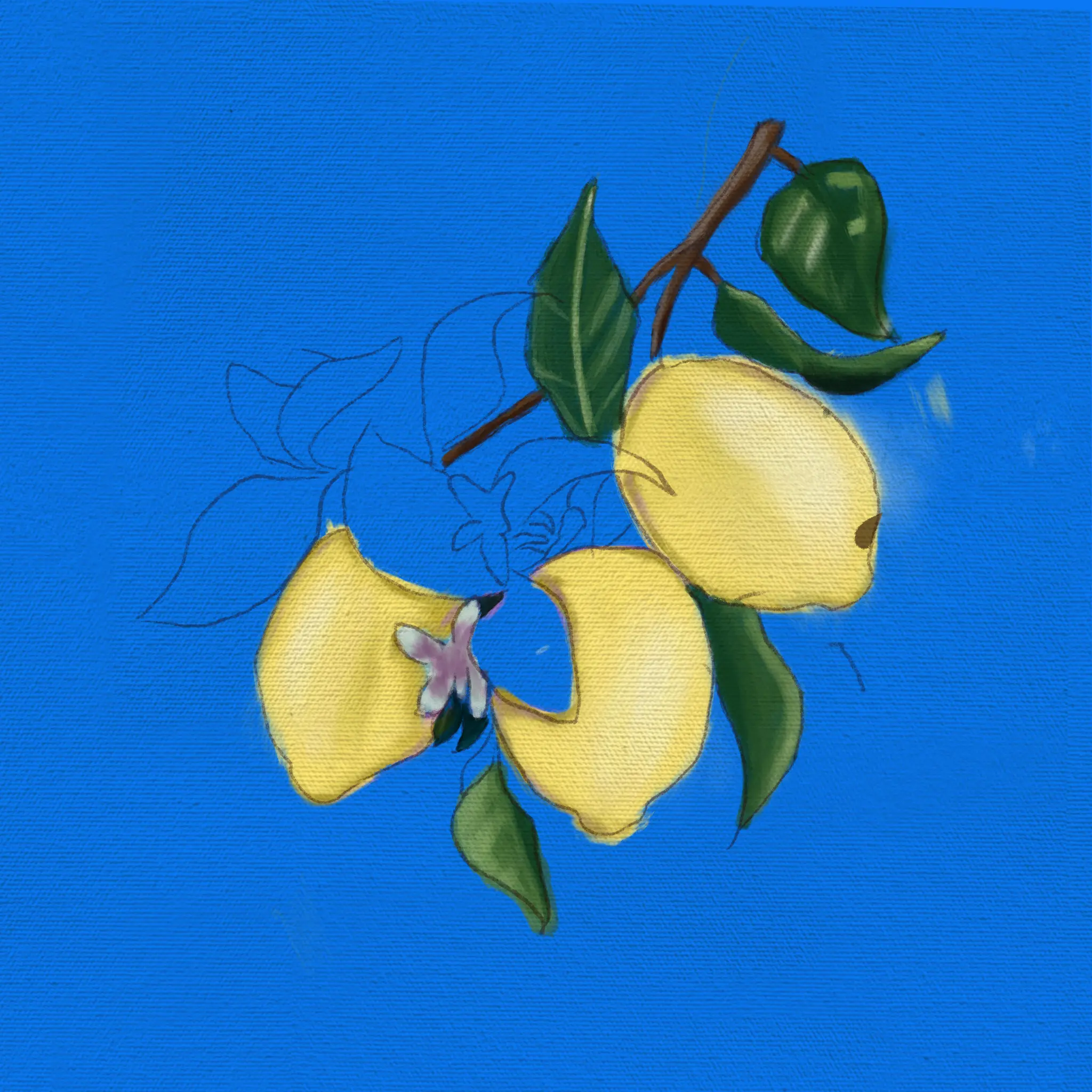
In this project I was assigned to create a book for our favorite band. I am a huge fan of Palace, a British alternative rock band focusing on ethereal sounds and lyrics. I wanted to portray that feeling of their music into this design, using only typography and layout for the inside of the book while combining illustrations on the outside to catch the eye.
My contribution
Illustration
Page Design
Software Used
Photoshop, Illustrator, InDesign, Procreate

Process
Rough Design
For starting this project, I used Procreate to make the illustrations first. In this case, it worked well because it allowed me to build the typography and the rest of the book off of the illustrations I made for the front and back covers. Then, I went to test and build out the layouts for the content pages and resorted to a unique, playful layout that was reminiscent of old Jane Austen books.
Research
When researching the band a little bit more, I came across some illustrations for their own albums and posters. They tend to have this unfinished handcrafted gouache look, and I formed my illustrations in that manner. I also came across a fantastic font that resembles the exact look of the Jane Austen books and implemented that into my designs.
Final Design
After my research I was finally able to build out the rest of the book Since I had already made layouts and created the text it was simple to implement the typeface, artwork and make adjustments that adhere to the assignment requirements.
Conclusion
I had a lot of fun working on this project and was glad to be able to showcase my illustrative techniques both in class and on my portfolio. Some adjustments I wish to make or do better, would be to improve some of the pages layout as the text columns close to the binding can be difficult to read in an actual print. I also think a re-do of the front cover typeface or my own handwriting would have worked better for this instance.